New Deep Dark Sea Blender Theme FREE Download
Darker than Blenders default dark theme with higher contrast and better colour coding. UI areas are better distinguished visually and improves readability. Text whites are also whiter than default, and a lot of areas of Blender are color-coded properly:
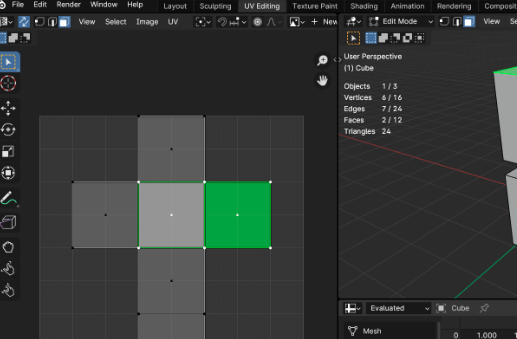
Edit Mode overlays (Vertex, Edge, Face, Point) are green, to match the colour of Blenders object data icons. Green is for edit mode!
Curve handle colours are unified across all editors, as well as other animation-related coloured overlays.
‘Face Orientation Front’ is gone. You can’t see the blue overlay when you enable it from 3D viewport overlays. You can always have it turned on and you’ll only see incorrect faces with red overlay. No need to keep switching it on and off!
Vertices, edges, f-curve points… they’re all thicker. Why do we keep stressing our eyes looking for them?
Active widgets (number fields, sliders, text inputs) get white like many other software. Better readability when writing. Also makes them pop more from the endless list of properties.
many more…






Post Comment